Graphing ANOVA Interaction Effects
The easiest way to see interaction effects with ANOVAs is to graph them. If you are working with a one-, two- or three-way interaction, you can use the user-created command anovaplot otherwise (or instead) you can use Stata's existing commands (though this may be a bit more complex). The instructions below will use anovaplot and then Stata's existing commands.
For the purposes of this example, accept the following: I ran an experiment looking at whether or not puppies influence happiness. I have a control group (no dogs or puppies, condition=1), an experimental group with full grown dogs (condition=2) and a second experimental group of just puppies (condition=3). Additionally, I have the participants split into two groups, those who consider themselves dog people (selfident=0) and those who consider themselves cat people (selfident=1). The dependent variable is happiness (named happy). In this case, all variables are between subjects. First I run the full ANOVA via anova happy selfident condition selfident#condition.
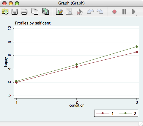
Now, I want to graph the cell means. First, I have to install anovaplot. Thus findit gr0009 and, clicking the blue installation link. When that is complete, I can issue the command anovaplot condition selfident, scatter(ms(i)) and get the following output. Notice that the first independent variable specified (condition) becomes the x-axis and the second variable (selfident) becomes the lines.