Race, Heat, and Redlining
Urban heat islands are often a legacy of racism. Cate Mingoya ’08 has ideas on how to fix that.
Global warming doesn’t affect everyone the same way, especially in big cities. Some neighborhoods are far more vulnerable to extreme heat than others. Lower elevation makes them vulnerable to flooding. More pavement soaks up sunlight during the day and radiates heat like a furnace at night. Fewer trees mean less shade. During a heat wave these areas, known as urban heat islands, heat up faster and stay hot longer. In some cities, the temperature in a heat island may be as much as 20 degrees Fahrenheit hotter than in other parts of the city, with devastating consequences for residents, who are often more likely to belong to marginalized communities.
As you might suspect, this is no accident.
No one understands this better than Cate Mingoya ’08. As director of capacity building for the nonprofit Groundwork USA, she leads an initiative dubbed Climate Safe Neighborhoods. Using satellite technology from NASA and NOAA, her team has compiled detailed maps of dozens of cities around the nation that track a host of variables such as temperature, tree cover, impermeable surfaces, and propensity for flooding.
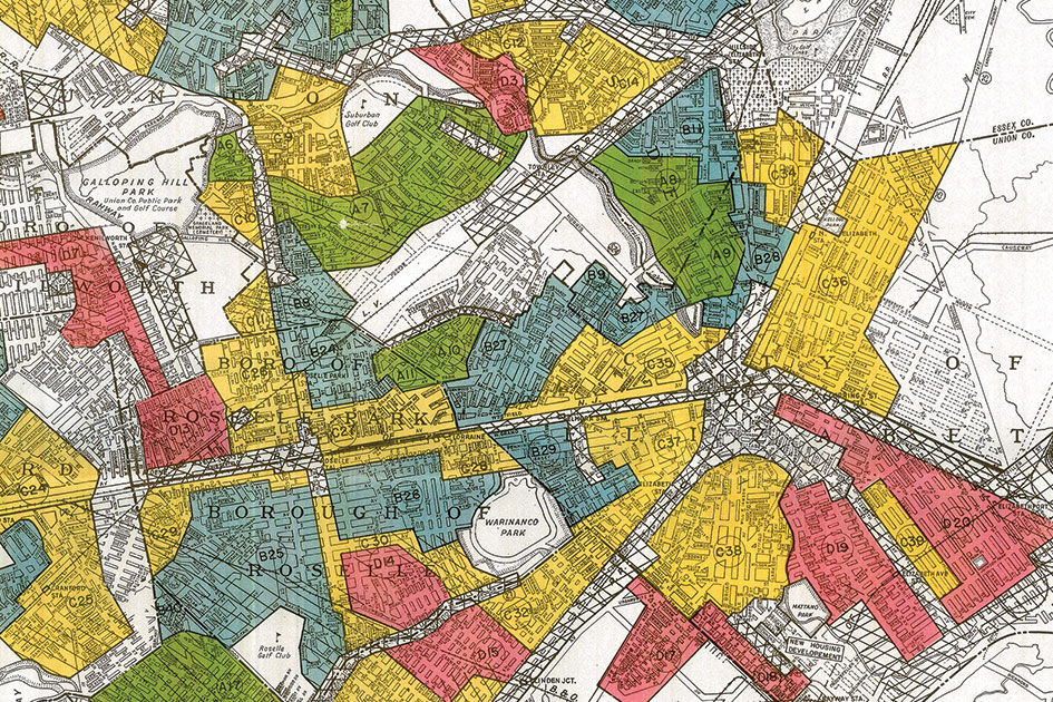
But the most striking thing about the maps is how closely they line up with maps made almost 100 years ago—the infamous “redlining” maps drawn up in the 1930s by the federal Home Owners’ Loan Corporation that perpetuated segregation for decades. On the HOLC maps, greenlined neighborhoods had top-quality houses and their residents were overwhelmingly white. Redlined neighborhoods had poorer quality homes and were populated by residents of color. (HOLC refused to back loans in redlined neighborhoods—often the only places where people of color were allowed to live—creating a vicious cycle.)
Set the HOLC maps and the climate maps side by side, and see for yourself. In Denver, Colorado, for example, the average summer temperature in the greenlined neighborhoods is 95° F. In the redlined neighborhoods, it’s 102° F. Impervious surfaces make up 28% of the greenlined neighborhoods but 60% of the redlined neighborhoods. Tree canopy covers 21% of the greenlined neighborhoods but only 4% of the redlined neighborhoods. And the pattern is repeated in city after city, more than 70 years after the maps were drawn up.
Of five cities in the study, the temperature in the redlined neighborhoods was 5 degrees hotter. They had 20% more impervious surfaces. And only a third as many trees.
“The consistency of this across the country lets you know this is no accident,” says Cate. “This is an intentional and insidious means of disadvantaging a group of people.”
Cate grew up in Queens, New York, in a neighborhood where “there was only one tree on the block, and every summer people used to fight for the shade.” At Reed she took courses in history from Prof. Jacqueline Dirks ’82 and religion from Prof. Kambiz GhaneaBassiri. She majored in biology and wrote her thesis on intraspecies recognition in cichlids with Prof. Suzy Renn. After Reed she did a stint with Teach for America in the Bronx, earned a degree in urban planning from MIT, and worked in public housing for the state of Massachusetts before joining Groundwork.
She began work on the project two years ago and has been heartened by its impact. “The maps have really transformed the minds of people who were skeptical of both structural racism and climate crisis,” she says. “It gives you energy and momentum to talk about changes in the future. Once you see it on the map, you can’t unsee it.”
Cate is working closely with residents in formerly redlined neighborhoods to press for change. For example, the maps showed that the Globeville neighborhood in Denver has only 1% tree canopy, compared to 23% in other neighborhoods—a figure that gave residents a concrete target to aim for. Now, thanks to neighborhood advocates, the city has promised to plant 3,000 trees in Globeville. “Our goal is to help neighborhoods become more resilient to climate crisis,” she says. “But we also want to help them build capacity to advocate for themselves in the political system.”
Tags: Alumni, Diversity/Equity/Inclusion, Climate, Sustainability, Environmental