Bar graphs
Bar graphs are a good choice for comparing data across different categories or groups. This example will get you started with bar graphs.
Using the wide-format blood pressure data, I'd like to compare blood pressure for patients before and after [some physical activity].
First load the data:
sysuse bpwide
Create an initial graph with blood pressure before and after:
graph bar bp_before bp_after
These dataset-wide means aren't really useful to me as visuals or as numbers. I'd like to break this down a bit:
Grouped by sex:graph bar bp_before bp_after, over(sex)
Grouped by age:graph bar bp_before bp_after, over(agegrp)
Grouped by sex and age:graph bar bp_before bp_after, over(agegrp) over(sex)
Note that the over() command shows data within the same graph. To generate separate graphs for each grouping, use the by() command.
graph bar bp_before bp_after, by(agegrp)
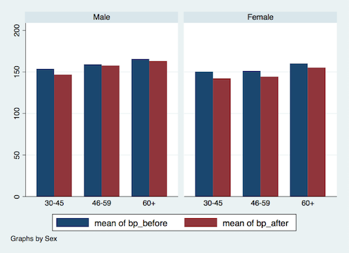
You can combine by() and over(); in this case, I want to visualize patterns within male/female, grouped by age:
graph bar bp_before bp_after, by(sex) over(agegrp)
The above code should generate a graph something like this:
Additional resources
Within Stata there are a wealth of options for visualizing data and modifying graphs.For a general introduction to graphics in Stata, see this guide from UCLA.
For details on the different possibilities for bar graphs, see the graph bar help documentation. UCLA also has a guide for adding error bars to graphs.