Excerpts from the Cooley Art Gallery Exhibition Lloyd Reynolds: A Life of Forms in Art
click to enlarge
Reynolds and the Bookplate
Lloyd Reynolds chose the bookplate to express his artistic vision as well as to earn money. Lloyd developed a clientele who wanted to identify their books in this pleasing way, part of the surge in bookplate production and collecting seen in the early to mid-twentieth century. As he filled orders, he retained an example in his small sample notebooks. Reynolds sold these plates for $3 to $6 per hundred, printing the majority of them from metal type and typographic flowers, arabesques, and lines using one or two colors. Later, he charged $10 to $15 per hundred for added linoleum cuts and wood engravings. The latter were the most difficult and provided an opportunity for the greatest detail, as the end-grain blocks used in wood engraving offered a far harder surface than side-grain wood or linoleum. Photos from the 1930s show him with his wood engraver, a wood block, and the leather-covered block support. Reynolds taught engraving as one of many related arts in his graphic arts workshop classes at Reed.
In 1936, there was a national competition for a new general bookplate to be used in titles added to the newly-built Hauser library (1930). Reynolds’ wood-engraved design showing the new library from the southwest won; this plate was used widely in the library until 1981. It is still tipped-in to special collection materials. Reynolds engraved a more intricate view of a cathedral-like library, probably the University Library of Leuven in Belgium, for use in the Woodbridge Collection of Belgian literary materials, another of the library’s special collections.
Reynolds and Fine Calligraphy
Lloyd Reynolds always spoke of calligraphy in etymological terms as "beautiful writing," coming from the Greek. Although he taught calligraphy in a historical context—how the Western alphabet developed and how it looked through the centuries—he also saw it as a fine art. The flow of the line was interpreted as motion for the body; once your hand learned the form, it should be allowed to move freely in the execution of the letterforms. He encouraged students who were too restrained, who attempted to be too exacting, to dance, to feel the motion, to see the pen dance across the page.
Through constant practice, Reynolds performed calligraphy in artworks meant for display on walls and in exhibitions. These are truly works of fine art, decorative pieces that please on several levels—the meaning of the words, the exuberance of the arabesques, the contrasts of colors and forms, and the overall composition. Some were made for presentation, some for entertainment, and some for the pleasure taken in creating great beauty.
Reynolds and the Writing out of Texts
Reynolds encouraged students in his graphic arts and calligraphy courses to write out papers, letters, and long texts in the Italic hand. This was both an excellent mental exercise to absorb the text and a chance for your fingers, your hand, and your arm to learn the motion of calligraphy. His favorite quartet of writers consisted of the three Bill’s and John: William Blake, William Shakespeare, William Morris, and John Ruskin, and their works provided many students with material for the final class assignment—to write out a longish text of interest. Reynolds himself practiced this discipline, generally writing out his talks and even the complete texts of several of his published works including his 1968 Commencement address, “Grow It,” and the Poems from the Pacific Northwest Poetry Conference Reed College April 1966.
Historical accuracy was also of importance to Reynolds in his text pieces, and he taught letter forms from historical examples. This framework allowed him to illustrate the development of the alphabet, how one form morphed into another in related but decidedly different ways. English secretary hand showing remnants of uncial and blackletter forms was an appropriate hand chosen by Reynolds in which to write out the unfinished piece from Chaucer’s “The Parlement of Foules.”

Reynolds and
the Theatre
Lloyd Reynolds and his wife, Virginia, were deeply involved in theatre at Reed. Both volunteered their time and energy to provide the make-up for actors in dozens of plays, though Lloyd was many times listed as the sole make-up artist in the program notes. He also lent his talents on the publicity side with poster, flyer, and sometimes program designs. As Reynolds gained competence in the various graphic arts he later taught in his Graphic Arts Workshop, his output became more visual and more varied. He often used bright red in eye-catching contrast to the heavy blacks in his early work. Not only did his calligraphy grace many posters in a large number of styles, but also the calligraphy of many of the hundreds of students who learned from him year after year.
Reynolds took a great interest in theatrical plays themselves, not only photographing them—witness the many images of early plays performed in the Eliot Chapel extant in his papers—but also acting in them. Whenever a faculty play was presented, and these were somewhat common in the 1930s through the 1950s, Reynolds was usually in the cast. One such play was the 1939 Reed College faculty presentation of Hazel Kirke, or The Man With The Irish Will, by Steele MacKaye, in which he played Dunstan, Hazel Kirke’s father, another was George Farquhar’s The Beaux Stratagem the previous year, in which Reynolds played the highwayman.
Reynolds and Calligraphy Projects
Being one of the few calligraphy experts in the Pacific Northwest made Reynolds a very popular person to commission for the creation of beautiful menus, commendations, logos, captions, and signs. Many Reed publications from the 1940s through the 1960s boast his swash capitals and appealing letterforms in their headings including the Reed Bulletin, Sallyport, and event schedules. In 1957, Reynolds calligraphed the entire text, including all the seniors’ names and thesis titles, for the college yearbook, the Griffin.
Others outside the college also clamored for Reynolds’ expertise in creating beauty. He wrote out invitations for the Reed College Women’s Association, commendations on parchment for bodies such as the Portland Club of Printing House Craftsmen and the First Presbyterian Church, menus for Portland restaurants, and the sign for a Portland branch library. Reynolds taught widely outside the college: at Marylhurst; at the Portland Art Museum; and in teachers’ classrooms in the Portland public school system and elsewhere. He was generous with his time and his talents and engendered much love and deep appreciation. It was no surprise when he received his own commendation as Calligrapher Laureate of Oregon from Governor Tom McCall in May of 1972, a well deserved award calligraphed by one of his students, Jaki Svaren ’50.
Reynolds and His Scribble Books
Generations of students remember the little booklets that Lloyd Reynolds would whip out of his shirt pocket to look through or write in. These were his "scribble books" and he kept them at least from 1953 through 1978. The brand stamped on an early booklet, "Scribble-In," was the name that stuck. They filled a combination role of notepad, diary, address book, practice sketchpad, and travelogue, and Reynolds used them to practice his calligraphy, keep notes on lectures, research, or sights, jot down addresses and directions, and capture the important details of his existence. In one, brief notes for a talk appear, probably a talk for his calligraphy class: “Browning + Arnold, Child Rolande—mood of human desolation—poetic exploitation of ugliness—great vigor, movement.” Travel notes follow him through Italy and England when he and Virginia took a sabbatical trip in 1959–60. Each year, these booklets showed the continuing advances in his letter forms, in his interests, and in his outlook on life.
Reynolds and His Heroes
click to enlarge
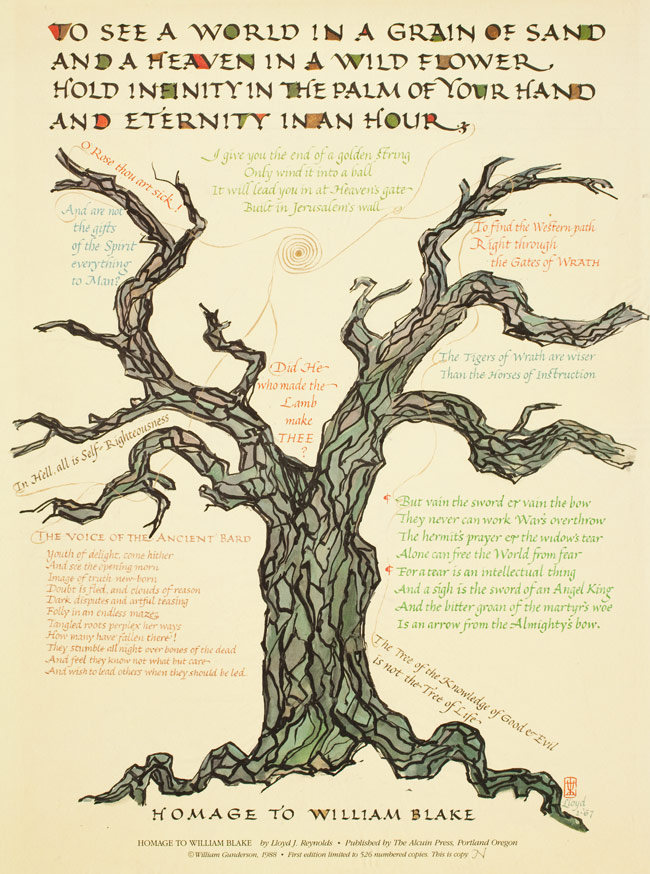
Having earned both bachelor’s and master’s degrees in English literature prepared Reynolds for teaching English and creative writing at Reed, but this also introduced him to writers who would become his heroes and whose works would follow him throughout his teaching career. His “three Bills and a John,” William Blake, William Morris, William Shakespeare, and John Ruskin, informed his lectures and provided the texts he offered students and inscribed himself in beautiful letter forms. Reynolds wrote that all of them “hated commercialism and industrialism and valued art, literature, and book-making.”
In particular, Reynolds revered and absorbed the ideas of William Morris: the fusion of beauty and function; the merging of art into life and natural forms into art; the use of all-over patterns and medieval design elements; and the complete involvement with the book—its design, illustration, illumination, and production. Morris propounded the “craftsman ideal,” that natural beauty, simplicity, and utility should infuse everyday life and everyday objects, and that goods should be made by artisans rather than by machines. Reynolds instilled this goal to a greater or lesser extent in every one of the many book artists, printers, designers, typographers, and calligraphers who emerged from his classes, and he repeatedly chose the writings of Morris and his other heroes to create his elegant artwork.
Reynolds and His Teaching Examples
Calligraphy classes taught by Reynolds, particularly in the 1960s, consisted of two three-hour classes a week in a studio setting. Reynolds lectured for the first hour of each class on the history of the alphabet, design elements of the page or of broadsides, and the formation of letterforms with a good dose of philosophy, literature, and general history thrown in. Readings included Asian philosophers and English writers, and the major texts were Edward Johnston’s Writing and Illuminating and Lettering—referred to by Reynolds as a “bolt of lightning” about teaching from the historical development of letterforms—Alfred Fairbank’s A Book of Scripts and A Handwriting Manual, Ullman’s Ancient Writing and It’s Influence, and most importantly his own Italic Lettering, Calligraphy, and Handwriting, a work still available for the budding student. Reynolds both collected lettering guides from everywhere and produced his own for his students. These were distillations from historical examples that pushed students into new territory and included blackletter and Hebrew alphabets.
In class, the focus was on learning by example, then practicing, practicing, practicing. Reynolds demonstrated each new alphabet and go over and over specific points of difficulty. He wrote out his demonstration texts on a butcher-paper covered giant easel, perhaps 4 feet by 8 feet in size, then marked the x-height at 4 or 5 pen-widths, drew lines on the paper, and proceeded to write those beautiful, elegant letters using a huge felt-tip marker with a 1 inch- to 2 inch-wide tip in black or red or brown ink. The layout of the page was also important, and time was spent on discussion of the Golden Ratio and the aesthetically pleasing arrangement of text on a page as expressed in Villard’s Canon of page proportions. This canon demanded text height equal to page width with margins at inside=2, top=3, outside=4, and bottom=6 for a 2:3 page and 1:1:2:2 for a square page. Always, new letterforms and concepts were prepared as hand-outs for class, master forms that continue to be used and shared by many of his one-time students.

click to enlarge
Reynolds and Weathergrams
Based loosely on the ideas of Japanese haiku, Reynolds’ weathergrams now have a permanent place in the Pacific Northwest calligraphy history. He defined the weathergram text as a sudden insight, so brevity—10 words or less—was essential. The subject matter should be seasonal, and the resulting vertical flag, preferably made of brown paper grocery bags, should be hung on a tree branch in "the garden, at a campsite, or along a mountain trail" and left outdoors between solstice and equinox, or equinox and solstice. The three-month weathering of these written statements was essential to the weathergram, a "weather-writing," as it started its journey back to nature.

click to enlarge
Reynolds wrote out the instructions for weathergram writing to go with a collection of them published by the Society for Italic Handwriting and Reed College in 1972. More weathergrams were gathered together after Reynolds’ death for the society by JoAnne DiSciullo and published in 1983. Some selections:
“If you carry flowers butterflies may follow your footsteps.”
“The horizon is drawn according to how tall we are.”
“The wings of moths can wear away mountains.”
“We let a bough or branch be our publisher.”
Reynolds and the Order of the Black Chrysanthemum
William Addison Dwiggins (1880–1956), or W.A.D., was a well-known East Coast graphic designer who created his own unique illustration style and unusual color schemes, the typefaces Electra and Caledonia, and a world of amazing marionettes with which he presented shows under their collective name, the Püterschein Authority. Credited with improving American book design in the 1920s and 1930s, he was a long-time book designer for Alfred Knopf. Dwiggins stood out as a one-of-a-kind artist with a wonderful sense of humor. One of his creations was Hermann Püterschein, a mythical character of Germanic background who wrote on design and the state of the world as Dwiggins’ alter-ego. Few knew Hermann was a joke.
Although it was highly unlikely that Reynolds ever met Dwiggins, the two shared a love of books, calligraphy, and design as well as a good sense of humor. Lloyd was smitten with the idea of this ephemeral German critic and created his own figure, Ludwig Püterschein, the son of Hermann. This tongue-in-cheek figure served as the front man for the O.B.C. (Order of the Black Chrysanthemum), an award devised by Reynolds for anybody who has ever put pen in pocket and had black ink spread into a ‘chrysanthemum’ on their shirt front, or who has spilled a bottle of ink, omitted or repeated letters, or started on the wrong line while writing out a calligraphic text. Ludwig, whose name was based on Ludovico degli Arrighi, a Renaissance scribe and type designer, also authored an impassioned plea for all Boards of Education to train teachers in Italic handwriting.
Reynolds and Campus Graphics
Elegant lettering on every poster, flyer, and sign became the norm on the Reed campus during the 1950s, ’60s, and into the ’70s. The enormous popularity of Reynolds’ classes in graphic arts and calligraphy meant that dozens of students were added to the population of calligraphers every year. Banner paper cost 10¢ per sheet, and the materials were easily at hand for student artists to mount yet another beautiful announcement in the student union or commons that everyone would see. Advertisements for roommates were written out in uncial, concerts were offered in blackletter, and Italic proliferated in memos and letters and even note-taking at lectures. This was the perfect mixture of function and art which fulfilled the William Morris philosophy that Reynolds discussed in class. It also allowed students to create beauty with their hands, often a welcome balance to the more normal periods of long and strenuous mental activity. And Reynolds himself also participated in the campus signage at this time, setting a standard to which students aspired. Many became so expert that it was hard to see any difference, and these were the students who became graphic designers, typographers, and professional calligraphy teachers and sign-painters.
Reynolds and his Personal Symbols
Always fascinated by symbols and their meanings, Reynolds was naturally drawn to symbols representing the individual. He gathered a collection of Asian chops and used them to sign his works—beside his name. He had studied the popular Book of Signs by Rudolf Koch (1930) with woodcuts by Fritz Kredel and had an interest in cattle brands and other symbols used for signage. Reynolds finally settled on the symbol for the thunderbolt, perhaps harking back to the many references in his life to a sudden insight, such as with his weathergrams. His personal sign, the double trident-fork was both Thor’s thunderbolt and Neptune’s trident and no doubt resonated with other meanings for him as well. A large metal version was also made for him in a slightly different design.

click to enlarge
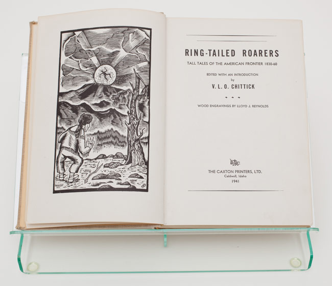
Reynolds and Book Illustration
Reynolds provided the illustrations for many publications beyond his own works, though most were associated with Reed. English literature professor Victor Chittick, who taught at Reed from 1921 to 1948, edited a collection of frontier tales from 1830 to 1860 called Ring-Tailed Roarers, for which Reynolds provided the wood engraved illustrations. Printed by the Caxton Printers of Caldwell, Idaho, in 1941, it went into a second printing in 1943, and a third in 1946. The many vignettes and illustrations are perfectly suited to the period of the stories, displaying the heavy borders and the style of the old Wild West imagery down to showing the dig of the engraver. Although woodcuts and wood engravings would have been used in the mid-nineteenth century, zinc plates were probably made from Reynolds’ engravings in order to print them with the text for this book. He identified most of his engravings by a small “LR” in a corner.
A cofounder of the Champoeg Press at Reed with several others including Dorothy Johansen ’33, Reynolds not only oversaw the type-setting and printing of the first publication from the press but provided an illustration both for it and the press’ publicity. That first book was Jesse Applegate’s A Day with the Cow Column in 1843, introduced by Dorothy Johansen and printed in 1952. The press run of 225 copies was sold out within months, but the production team decided type-setting and printing by hand was too much work. Afterwards, Lawton Kennedy of San Francisco took on the design and printing, but Reynolds continued to provide vignettes and other illustrations for widely-varying publications.

click to enlarge
Reynolds and Awards
Reynolds’ great enthusiasm for and promotion of the Italic hand and of teaching a legible and beautiful handwriting to students and teachers brought him into contact with a broad spectrum of fields and peoples. He was a founding member of the Society of Italic Handwriting in England and later made the American Vice-President; he also organized the Western American Branch of the Society which later became the Portland Society for Calligraphy. Reynolds taught successfully outside of Reed College at the Portland Art Museum, Marylhurst College, the Menucha artists’ retreat, the Haystack Workshop at Cannon Beach and he was invited all over the United States to present lectures. Given his engaging personality and devotion to teaching, it is no wonder he garnered many awards. His dedication was acknowledged perhaps most broadly by his appointment as Calligrapher Laureate of Oregon by Governor Tom McCall in 1972. The Art Direction Group of Portland also awarded Reynolds their highest accolade with the Trajan Award in 1966, while the Portland Art Museum presented him with their distinguished service award in 1969. Reed conferred an Honorary Doctorate of Humane Letters on Reynolds in 1972.
Reynolds’ Correspondence
Lloyd Reynolds maintained a massive and wide-ranging correspondence with past students American and British colleagues interested in calligraphy and its spread. Many of the most-respected and best known practitioners became friends and longterm correspondents of Lloyd, including Brits Alfred Fairbank, Tom Gourdie, and Donald Jackson, and Americans Father Edward Catich, Ray DaBoll, Arnold Bank, and Paul Standard. Reynolds’ Reed connections included Gary Snyder ’51, Georgianna Greenwood ’60, and, most particularly, Philip Whalen ’51, as well as many others. Letters received from these friends were often decorated with borders of decorative letters or words, or with small drawings; all are lively and most elegant with their beautiful writing. Some students from Lloyd’s classes sent along practice sheets to be checked over and corrected, and a great number of teachers and other educational administrators were among his admirers, including nuns from Marylhurst College and Mt. Angel College and Convent.