Lloyd Reynolds, Robert Palladino, and Calligraphy at Reed College
by Gay Walker ’69, Special Collections Librarian, Reed College Library
If one had to select a single word to describe Lloyd J. Reynolds, it would be “passionate.” He was passionate about teaching, literacy, culture, history, the spirit, and about letter forms and calligraphy. Although he was an excellent calligrapher, certainly one of the best in the country, he was a teacher first, able to merge beautiful letter forms into his vision of the world, successfully and permanently influencing his students, and providing them with part of his vision. As Jaki Svaren ’50, a student of Reynolds and later an author and teacher herself, said, “The calligraphy got students to come to the class, then Reynolds took off, talking about the whole of the human condition . . . As he made so clear, when you raise a daily activity to the level of art, you begin to look differently at the other seemingly simple aspects of your life. Lloyd Reynolds was trying to open us up to the miracle.”
 Sumner Stone ’67, the influential type designer for Adobe, notably of the Stone family of types, studied with Reynolds at Reed College in the 1960s. He said “Reynolds was an incredibly charismatic teacher, and his interests were somewhat broader than the traditional academic program of Reed at that time. He was willing to talk about religion and spirituality. The classes were a window on the relationship between visual arts and culture in a very broad sense. And then, there was the practical aspect—with calligraphy you could actually make things, and that became almost a cult! There were always people lettering signs and posters that went up around campus, and everyone would critique them.”
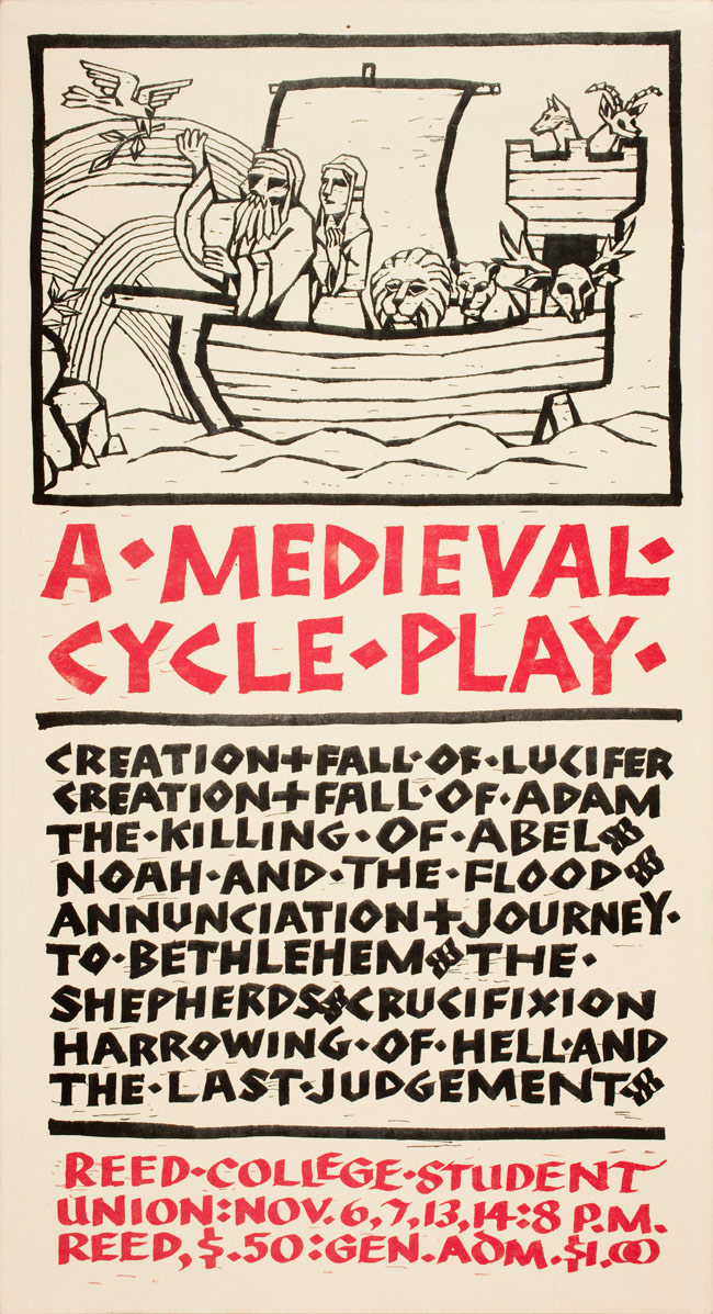
That beautiful imagery atmosphere became the norm. Of course all signs and banners at college were beautiful. Of course every hand-produced flyer and ticket and card was lettered in one of many flowing, elegant, and pleasing styles, black and bold, but precise and elegant. More and more students wanted to be able to do that, too. The calligraphy course gave students a barrage of information and theories based on graphic design principles and historical precedents, and a kaleidoscope of ideas and authors to read and artists to study. It was a transforming experience, pointing many firmly towards typography, letterforms, and the book arts.
The testimonials collected from his students for the Heritage of Calligraphy event at Reunions 2003 reveal his influence and that of his successor, Robert J. Palladino. Some participants are now type designers, teachers, and graphic artists including Sumner Stone ’67, Chuck Bigelow ’67, Kris Holmes ’72, Mike McPherson ’68, Georgianna Greenwood ’60, Elizabeth Anderson ’72, Jim McGill ’70, Lance Hidy, John Laursen ’67, Lee Littlewood ’68, and Margot Voorhies Thompson ’70. Reynolds' influence on other students was apparent in the assimilation of art and letters in their lives. Many connected with different elements in his teaching: Zen Buddhist ideas, the celebration of nature, the merging of beauty and function, and a belief in the individual and what one person can do.
Click to enlarge
Reynolds spent his entire teaching career at Reed College, from 1929 until 1969. Started in 1911, Reed College in 1929 was still a fairly new, small, independent, and strongly academic institution. It eschewed sports and fraternities as being distractions from the academic life, but it was open to creative thinking and unique personalities, and Reynolds was a good match. Reynolds had earned a bachelor’s degree in forestry at Oregon State College, but found he “was no good in the woods cutting down trees.” He went on to earn a second bachelor’s degree and a master’s degree in English literature from the University of Oregon.
click to enlarge
Morris propounded the “craftsman ideal,” that natural beauty, simplicity, and utility should infuse everyday life and everyday objects, and that goods should be made by artisans rather than by machine. Every book artist, every letterpress printer, every designer and typographer, calligrapher and artist is living Morris’ ideal to a greater or lesser extent, and Reynolds instilled this goal in so many of his students.
 Traditional design principles, the most pleasing design elements from the past, the best of the Eastern and European holistic views, and helping the student create beautiful images—harmonizing the manual and the intellectual, were all basic to Reynolds’ teaching. And he saw handwriting as one of the crafts: we all do it, it is taught in all schools, it has direct links to literacy and print, and it transforms learning. Facilitating the merger of this manual discipline with the intellectual and the creative was Reynolds’ passion as a teacher.
click to enlarge
To earn money on the side, Reynolds took up block cutting and type setting, printing bookplates for people at $3 to $10 per 100. He created art prints and illustrations for various publications but, as seen in his college class notes, his handwriting at that time was undistinguished—rushed and somewhat cramped. He also taught high school in Roseburg, Oregon, for two years, learning how to express a total thought in a succinct manner. He was an enthusiastic teacher who energized and motivated his students, but he also realized that one must teach the teachers if change was to come in how and what students were taught.
 Reed hired Reynolds as an instructor to teach English and creative writing. Mary Barnard ’32, the poet, was one student who fought with Reynolds as her adviser, completed a creative thesis of exquisite poetry, and became a lifelong friend of his. In 1950 and ‘51, three students were all greatly affected by him, his beliefs, and his calligraphy. They were Gary Snyder ‘51, Philip Whalen ’51, and Lew Welch ’50, all later members of the Beat Poet movement. As a teacher, Reynolds was a mentor who could energize and inspire and revolutionize a person’s thinking.
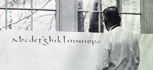
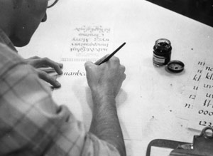
During his first decade of teaching at Reed, Reynolds began to explore letterforms and practice a more controlled yet flowing hand. In 1934, he discovered Edward Johnston’s book, Writing and Illuminating and Lettering, which influenced Reynolds immediately and profoundly. He called it a “bolt of lightening.” “It seemed perfectly obvious—the only logical approach is the historical one. Learn to cut reed and quill pens and write your way through the history of the alphabet!”
Reynolds began writing in the Italic hand of fifteenth- and sixteenth-century Italy, choosing Italic because of its close resemblance to standard print and the attraction of reading print associated with the beautiful handwritten Italic letter forms. Ravenous for information, for details, for discussion with others, Reynolds began to correspond with the western world’s best-known calligraphers, Alfred Fairbank in England, and Arnold Bank, Ray DaBoll, and Father Edward Catich in the U.S. There was really no one in the Pacific Northwest, very few in the Western United States, and only a handful of practitioners in the East.
Johnston’s work was an introduction to the historical development of letterforms with examples, but Reynolds delved deeper into the literature, devouring the available works. For over 10 years he taught informal classes at Reed, and bulletin boards and walls around campus began to sport beautiful handwritten signs.
click to enlarge
Then in 1948–49, he taught a yearlong course for credit in alphabetic communication, an hour lecture and two hours of studio work with the edged pen and printing types.
Wildly successful in reaching students and getting them to think, to open up, to make connections, Reynolds could talk coherently and persuasively for hours based on such notes as “Browning + Arnold, Child Rolande—mood of human desolation—poetic exploitation of ugliness—great vigor, movement.” One of his students, Chuck Bigelow ’67, who taught at Stanford and is now at the Rochester Institute of Technology School and has designed typefaces, including the Lucida family with his partner, Kris Holmes ’72, said, “Lloyd saw calligraphy as the visible means of literate expression and, through that, as a gateway to the history and lore of civilization. Moreover, it is a link between one’s own simple, utilitarian practice of handwriting and the accumulation of knowledge and scholarship through the ages.”
Reynolds was tireless in teaching the Italic hand to teachers both at Reed in its Masters of Arts in Teaching program and outside at the Portland Art Museum, at Marylhurst College, and in workshops and classes all over the state and the country, especially aimed at the elementary level so that whole new generations of teachers would command and spread this beautiful but functional art. He instigated and co-curated a seminal exhibition, Calligraphy: The Golden Age and its Modern Revival, at the Portland Art Museum in 1958, which showed both historical and current works. He brought Arnold Bank and then Father Edward Catich to campus to lecture, and he took a sabbatical trip in 1959–60 to study original inscriptions and manuscripts in Italy and England, where he also visited Fairbank and others. In 1968, he organized the Western American Branch of the Society for Italic Handwriting, now the Portland Society for Calligraphy, which accounted for more than half the organization’s international membership and was made up mostly of teachers. Reynolds was selected that year for the Men Who Teach series to make 20 television programs, “Italic Calligraphy and Handwriting,” for the Oregon Education Television Service, which he redid in color eight years later. You can see why Reynolds was credited with largely introducing Italic handwriting in the Western United States.
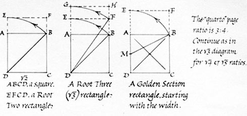
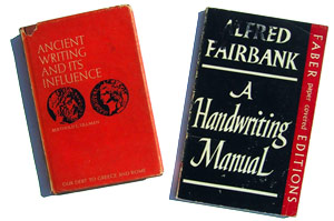 In class at Reed, Reynolds took students through the history of the alphabet and Latin scripts. We had a lesson in Hebrew with the reed pen, and then concentrated on Renaissance Italic hands and Roman capitals, the lettering practice always interspersed with lectures and analysis and ideas. The texts were Fairbank’s A Book of Scripts and A Handwriting Manual, Johnston’s work, Ullman’s Ancient Writing and It’s Influence, and most importantly his own Italic Lettering, Calligraphy, and Handwriting, a booklet that could be stood up in front of the student like a pup-tent with model letter forms to be copied. Originally published by Champoeg Press, which Reynolds cofounded at Reed, the latest edition, Italic Calligraphy and Handwriting: Exercises and Text, is still available in print. Lloyd would tell students to “practice and keep practicing; the hand will learn the letterforms. Let your hand do it.”
 Reynolds’ integrated concept of reality could be seen in his writing and in his talks outside the classroom. He bemoaned the western arts tradition of separating the manual from the intellectual, believing that “reality is a continuum, not a hierarchy where the artist opposes the intellectual, the craftsman the antithesis of the educated gentleman.” He thought there was a false distinction between the decorative and the fine arts. In support of this view, he introduced the Asian arts, readings from Coomaraswamy, and particularly Chinese calligraphy to the campus.
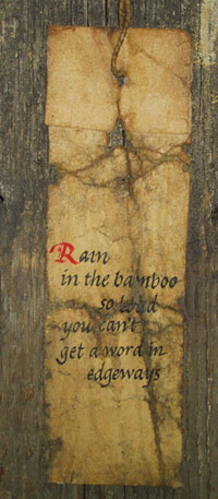
Along the way, Reynolds developed the “weathergram,” a poem form of 10 words or less capturing a “moment of insight” in nature. Written on a strip of paper, preferably cut from a brown grocery bag, the weathergram was hung on a tree branch, in the garden, or along a trail. Like haiku, it was a brief appreciation of interconnectedness, a thing, or a moment. His poetry had a Pacific Northwest flavor, and Reynolds preferred the colloquial phrase so that they were somewhat “like an iceberg; most of it is out of sight. The writing should be spontaneous and should not look contrived or self-conscious.” The layout was the punctuation. Here are a few examples:
A few inches of puddles—miles of sky.
Scampering leaves & the kitten stop the garden rake.
The swayback old barn is turned out to pasture.
The valley wedges down between its mountains.
Sunlight under dark soil comes up dandelions.
From being an instructor in English and creative writing at Reed, Reynolds advanced to teaching: a graphic arts workshop with printmaking, letterpress printing, and design; art history encompassing everything that interested him; paleography; and calligraphy. In 1966, he was feted with a Festschrift gathering 60 offerings from his friends and spearheaded by Philip Whalen ’51, an impressive work with poetry from Gary Snyder ’51, James Dickey, William Dickey ’51, Carolyn Kizer, William Stafford, Dell Hymes ’50, Mary Barnard ’32, Vern Rutsala ’56, and Phil Whalen ’51, music from Jacob Avshalomov ’43 and Mark DeVoto, writings from Alfred Fairbank, Ray DaBoll, Byron MacDonald, John Cage, James Hayes, Clyde Van Cleve ’55, and Fr. Edward Catich, and art from Cindy Parker ’66 and Manuel Izquierdo.
click to enlarge
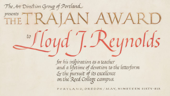
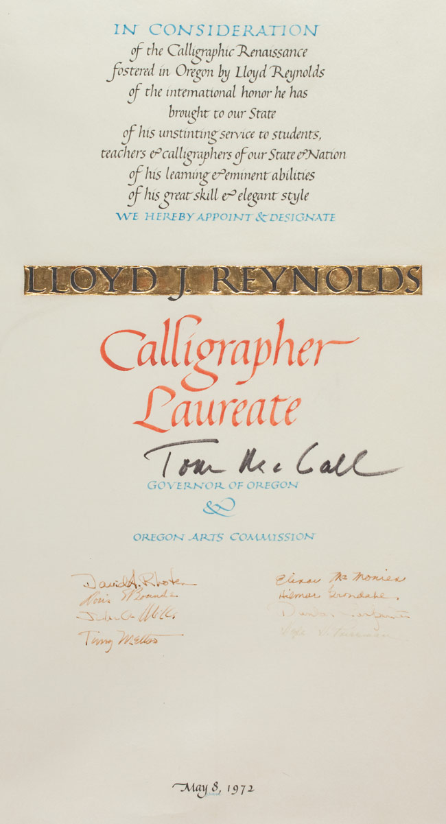
Between his retirement and his death in 1978, Reynolds taught courses everywhere, including the Haystack Summer Workshops for many years in Cannon Beach, Oregon, and the summer arts program at Camp Menucha along the Columbia River Gorge. Reynolds was well honored in Oregon. Governor Tom McCall named him the first (and only) Calligrapher Laureate of Oregon in 1972. He also received the distinguished service award from the Portland Art Museum, an Honorary Doctorate of Humane Letters from Reed, the Governor’s Award for the Arts, and the Watzek Award from Lewis & Clark College. In 1979, many of his writings were gathered into the volume Straight Impressions. Many of his students collaborated on an alphabet in Reynolds’ honor that still hangs in Reed's Hauser Library.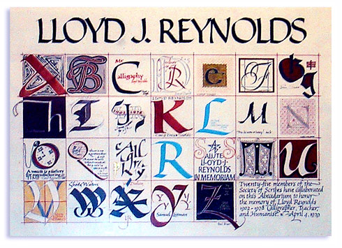
Reed library’s special collections now has Reynolds’ personal graphic arts library along with his papers and calligraphy samples. They are open to the public, and all of the collection is described in the finding aid available online at the library’s website.
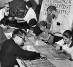
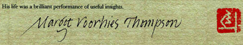
In 2003, Reed’s alumni reunion included exhibits, lectures, scriptorium demonstrations, panel discussions, and over 90 written testimonials. The college felt the outpouring of enthusiasm, sentiment, and beautiful writing inspired by Lloyd Reynolds. Artist Margot Voorhies Thompson ’70, introduced to Lloyd as a 14-year old student during an assembly and who ended up a friend for life, wrote this about her mentor:
“With felt pens squeaking across vast sheets of butcher paper mounted on an easel before us, Lloyd moved with ease through the evolution of two thousand years of western letter forms. His speech was audacious. The intricacy of information imparted through his demonstration and accompanying commentary was exciting and seductive, all of it delivered in his inimitable style, a dazzling performance of insights . . .
Through the course of a single hour, Lloyd was able to take more facts and ideas than most individuals contemplate in a lifetime and wind them into an interconnected and complex web of fascination. This was his natural pace . . .
Under Lloyd’s influence, students found exhilaration through the practice of critical thinking and its practical application . . .
His life was a brilliant performance of useful insights.”
Before retiring, Reynolds called upon his friend and one-time student Robert Palladino, previously a Trappist monk and scribe from the Trappist Abbey in Lafayette, Oregon. Palladino had studied various letter forms since his entry into the order at 17; he provided signage for the Abbey and calligraphy for works from the Benedictine Press at Mount Angel and various religious art projects. When he left the order in 1968, he came to study with Reynolds, who encouraged him to spend six months with Father Edward Catich in Iowa, with whom he studied Roman majuscules from Trajan’s Column in Rome, other stone inscriptions, printmaking, stone carving, drawing, and art history.
Appointed to teach Reynolds’ calligraphy classes in the fall of 1969, Palladino held this part-time position until 1984, when the art department voted to change the curriculum. Palladino’s influence on the campus and the students during that 15-year period was significant. Posters, flyers, and announcements remained beautiful throughout the campus, and students continued to experience the wonderful connection between letter forms and history, writing and movement, function and beauty, and the practical application of critical thinking.
Palladino went on to teach and perform calligraphy at the Portland Art Museum, Portland State University, Marylhurst University, and Mt. Hood Community College, fulfilling Reynolds’ directive to teach the teachers. He also participated as one of several of Reynolds’ students in the move to bring italic into the Portland Public School System. Returning to the priesthood in 1995, Father Palladino served his parish but always undertook the signage and textual art jobs. Now retired, he continues in his love and practice of both music and letter forms.
Although calligraphy is no longer taught at Reed College as a for-credit course to students, that heritage continues to swirl around—in exhibitions, Reunions themes, Paideia classes, a weekly Calligraphy Scriptorium, and in the steady archival use of the Reynolds’ papers. The sensibility and sensitivity about letter forms demonstrated by both Reynolds and Palladino have morphed out into the world, for instance in typeface design by Sumner Stone ’67 at Adobe, Chuck Bigelow ’67 and Kris Holmes ’72, and Paul Shaw ’76; in the computer language interface initiated by Steve Jobs and Adobe; in graphic design by Michael McPherson ’68, Elizabeth Anderson MAT ’72, and Lee Littlewood ’68; in the art of Margot Thompson ’70, Anita Bigelow ’67, Bob Ross ’61, and Diana Stetson ’79; and in the teaching and practice of calligraphy by Clyde Van Cleeve ’55, Dorothy Dehn ’61, Marilyn Holsinger MAT ’65, Georgianna Greenwood ’60, and Steven Herold ’63. It is no wonder that Reed College and its calligraphy heritage will remain the focus of much interest in the world of letter forms.