Primary Colors: Texas
Shisham Adhikari, Shulav Neupane, Logan Wilson
The party’s black voters have been decidedly with one candidate (former Vice President Joe Biden), its Hispanic voters have been leaning toward another (Sen. Bernie Sanders) - Perry Bacon Jr., FiveThirtyEight
In a world where the pandemic is not happening, the democratic primaries would be on the front page of all the major news outlets. With the Super Tuesday exit polls showing a clear racial preference for certain candidates, statements like the ones above have become commonplace for political pundits (CNN , NBC). But, how reliable are exit polls (FiveThirtyEight)? Do these statements pass a robustness check done with census data? In this blog post, we will investigate whether a racial bias exists using county-level demographic data from the 2018 American Community Survey (ACS). We will focus on Texas as it is a heavyweight in terms of delegates and was also one of the closer democratic primaries.
The ACS is a regularly updated source of demographic information, as opposed to the decennial census. We use the get_acs function within the tidycensus package to get the county-level data for racial demographics. Then, we changed the dataset to include the percentage of the population for each variable rather than raw numbers. The average margin of error for the estimates for the 2018 estimates was about 20%, though this high error is partly due to some counties having a margin of error close to 100%. Then, we obtained primary results data from Washington Post and combined that with the census data with each variable reflecting votes as a percentage of the total. We used left_join to do this, which basically combines two datasets based on a shared variable, which was the county name for us (called NAME in the ACS data and Counties in the primary results data).
#Note that this snippet excludes the part
#where we change variables to proportions
library(tidycensus)
txData_full <- get_acs(state = "TX",
                  geography = "county",
                  variables = c(Population = "B01003_001",
                                Hispanic = "B03002_012",
                                Black_pop = "B02001_003"),
                  geometry = TRUE) %>%
  select(-moe) %>% #removing irrelavant variables
  spread(key = variable, value= estimate) %>%
#converting data to have each column as a variable
  left_join(county_results,by = c("NAME" = "Counties"))
#joining the census data with county specific election results
We start by visually representing the relationship between racial breakdowns of the Texas counties and the primary results in those counties. Luckily, the census data is inherently geographical, which allows us to create maps of Texas with our data. For example, here is a map we created for the winners of each county using ggplot. Note that we will only consider Biden and Bernie for our analysis as the other winners are not relevant in the race anymore.
load("/Users/mcconvil/Desktop/Cumulus/Courses/Spring 2020/math241s20/Projects/MiniProject2/math241S20PostGrp8/data/txFinal_data.rda") #loading our combined dataset
library(ggplot2)
ggplot(data = txData_full) +
  geom_sf(aes(fill = winner), color = "black") +
theme(axis.text.x = element_text(angle = 90, hjust = 1)) 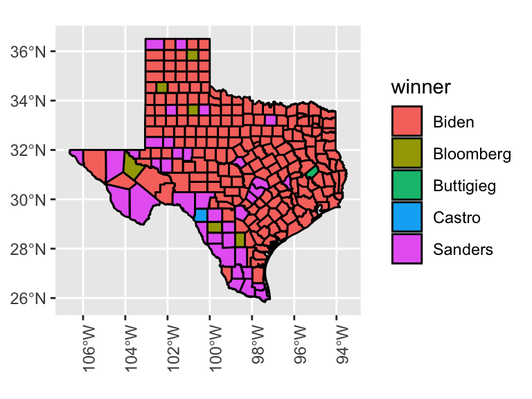
Figure 1: Winners of the Democratic Primary by county in Texas
Just from the map of the winners of each county, a narrative starts to form. Sanders did better in the south-west and Biden dominated the north and the east. Additionally, even though Biden only beat Sanders by 4% of the overall vote, Biden won many more counties than Sanders, because of his popularity in small rural counties. Of the 20 counties with the least amount of votes, Biden won 13 of them. Now, we look at the racial relationships. We focus on the black and Hispanic (Latino or Hispanic race responses, not the ethnicity category) populations. Which candidates do they prefer?
ggplot(data = txData_full) +
  geom_sf(aes(fill = Black_Prop), color = "black") +
  scale_fill_viridis_c(option = "magma") +
theme(axis.text.x = element_text(angle = 90, hjust = 1)) 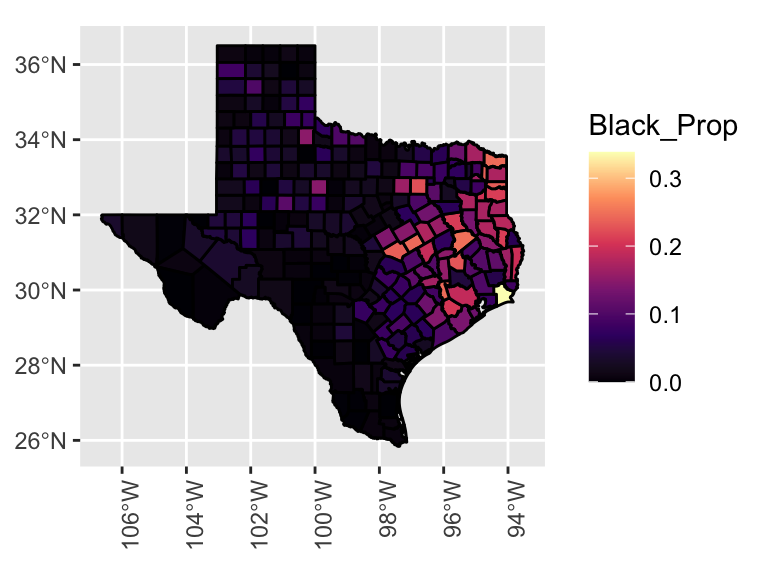
Figure 2: Proportions of black residents by county in Texas
ggplot(data = txData_full) +
  geom_sf(aes(fill = Hispanic_Prop),color = "black") +
  scale_fill_viridis_c(option = "magma") +
  theme(axis.text.x = element_text(angle = 90, hjust = 1))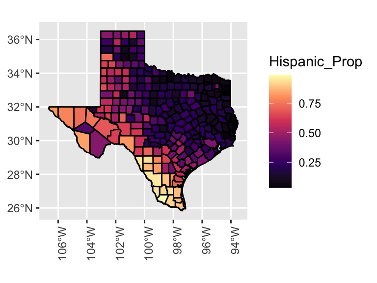
Figure 3: Proportions of Hispanic residents by county in Texas
The black proportion graph provides a visual answer. Sanders’ victorious counties have an unusually low number of black people. They mostly live in the eastern part of the state, which were Biden’s stronghold. The Hispanic proportion graph shows another story. Bernie won counties with high Hispanic populations. Since there is no way to tell who voted from our data, we cannot tell whether the Hispanic people themselves voting for Bernie or, if living alongside a lot of Hispanic people makes voters more likely to vote for Bernie. However, exit polls can tell us just that.
| Race | Biden | Sanders |
|---|---|---|
| Black (21% of voters) | 60 | 17 |
| Hispanic/Latino (31% of voters) | 24 | 45 |
The New York Times exit polls results are shown above. Exit polls are conducted by standing outside a polling station and asking voters how they voted. The exit polls for race suggest that Biden had a significant majority (60%) of black voters in comparison to Sanders (17%). Similarly, Sanders had more (45%) Hispanic voters than Biden (24%). Both these exit polls results on racial biases match the conclusions we made based on our visual analysis. But exit poll data becomes unreliable due to factors such as early voting. Another way to get at these percentages is though our census data.
Using census data, we can get the average proportions of various demographics in counties won by the two using the summarize function in tidyverse. While the voting population may not be similar to the total population, this provides us with another, admittedly incomplete, sense of the racial differences. We find that Biden had a 5 percent-point higher black population in his winning counties compared to Sanders while he had a very large deficit of about 30 percent-point when it came to the Hispanic population in the counties. This is similar to the exit polls.
prop_winner <- txData_full %>%
  group_by(winner) %>%
  summarize(black_prop = mean(Black_Prop),
            hispanic_prop = mean(Hispanic_Prop)) %>% #finding proportions
  st_set_geometry(NULL) %>%
filter(winner %in% c("Biden", "Sanders")) #removing other candidates| Candidate | Percentage of Black Population | Percentage of Hispanic Population |
|---|---|---|
| Biden | 0.07 | 0.30 |
| Sanders | 0.02 | 0.61 |
Another way of looking at the question is to see whether the proportion of black and Hispanic residents in Texas is related to the votes that Sanders received and doing the same analysis for Biden. We checked whether counties with a higher black population voted for Sanders at a higher rate and do the same with the Hispanic population and Biden. In R, this can be done through the correlation function, cor(). A positive value indicates that such a relationship does exist and a negative value indicates that a higher population of that race actually led to lower vote proportions. We see positive correlations for the black population and Sanders, and the hispanic population and Biden but a negative correlation for the other two pairs. This, again, is in line with the exit polls.
cor(txData_full$bernie_votes,txData_full$Black_Prop) #Bernie and Black propotion## [1] -0.1777313cor(txData_full$bernie_votes,txData_full$Hispanic_Prop) #Bernie and Hispanic propotion## [1] 0.3732507cor(txData_full$biden_votes,txData_full$Black_Prop) #Biden and Black propotion## [1] 0.4536019cor(txData_full$biden_votes,txData_full$Hispanic_Prop) #Biden and Hispanic propotion## [1] -0.5413583In the Texas primary, racial data allows us to predict semi-accurately if Biden or Sanders won a given county. However, there could be inaccuracies because the voting population is not an accurate representation of the actual populations of the counties. Nevertheless, using county level race data, we are able to look for any racial biases for the main democratic primary candidates: Biden and Sanders. We found that the party’s black voters support Biden and Hispanic voters support Sanders and this result matches what media and exit polls tell. For more information about how each canidates won the voters, check out these articles for Biden and Sanders.
Bibliography
Hao Zhu (2019). kableExtra: Construct Complex Table with ‘kable’ and Pipe Syntax. R package version 1.1.0. https://CRAN.R-project.org/package=kableExtra
Kyle Walker (2020). tidycensus: Load US Census Boundary and Attribute Data as ‘tidyverse’ and ‘sf’-Ready Data Frames. R package version 0.9.6. https://CRAN.R-project.org/package=tidycensus
Pebesma, E., 2018. Simple Features for R: Standardized Support for Spatial Vector Data. The R Journal 10 (1), 439-446, https://doi.org/10.32614/RJ-2018-009
Wickham et al., (2019). Welcome to the tidyverse. Journal of Open Source Software, 4(43), 1686, https://doi.org/10.21105/joss.01686
Yihui Xie (2020). knitr: A General-Purpose Package for Dynamic Report Generation in R. R package version 1.27.