trimetStops: Understanding the Public Transportation Near You
Brendan Mobley and Grayson White
Have you ever wanted to know exactly how many TriMet stops there are in the Portland metropolitan area? Perhaps you might want to know which direction those stops are facing, or even compare the coverage of bus stations and rail line stations? Well with the package trimetStops this information is in your hands.
Our package carries the dataset trimetStops, which has information on each TriMet bus stop and rail line in the Portland Metro Area as reported by TriMet, the original source for this data can be found here. This dataset can be used in lots of ways, but for example let’s walk through looking at how the TriMet stops are placed in space around the Portland Metro Area. To do this, we will first graph all the stops in Portland by their longitudes and latitudes. We have all the information that we need to do this already in our dataset, without needing to change it in any way! We can also differentiate between stations and platforms, which will add more information to our graph. In this example, stations are colored red and platforms are colored blue:
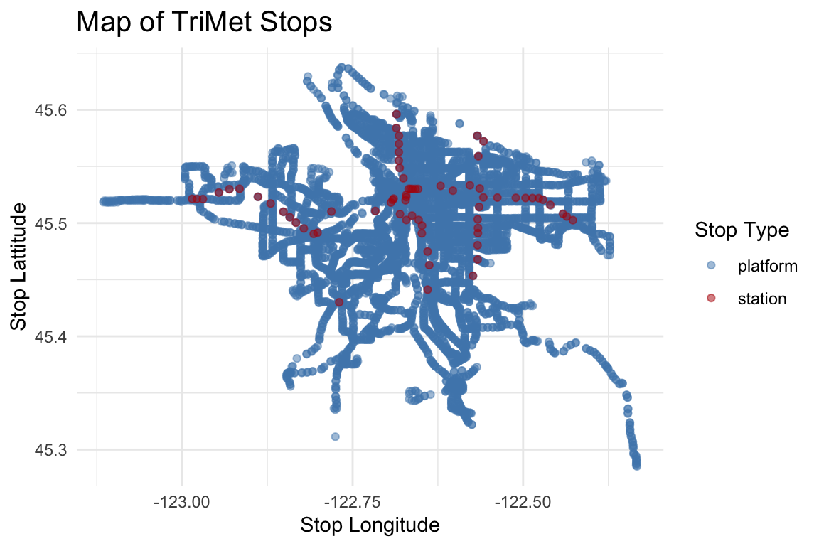
This map gives us a good idea how many TriMet stops are in the Portland Metro Area (lots!). It also clearly shows where the MAX Light Rail runs, as we can see a clear path of the red dots which represent the rail stops. Unfortunately that is about as much as we can figure out from this graph. That said, the spacial information on this graph is so accurate that it would be a good graph to put on top of a picture map of Portland.
Another option for visualizing TriMet stops would be to look only at the stops in your neighborhood. In this example, we will look at the Woodstock neighborhood. All you need to know to do something like this with trimetStops is the longitude and latitude of your neighborhood. Here is Woodstock:
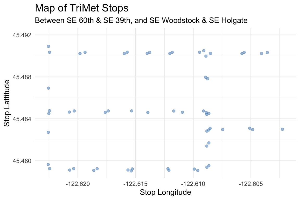
This graph is more clear than the graph showing all of Portland, as we can easily see where the stops are located, in this case we see that there are many bus stops on 39th, 52nd, Woodstock, Steele, and Holgate.
This snapshot of a neighborhood model can show us even more than what is on this graph. For example we can also learn which cross streets and directions that busses leave from these stops. If we wanted to know even more about the stop, we could follow the link provided in the data to learn things such as which bus lines run to a certain stop, and when the next bus arrival is. We can do this for the westbound stop at 51st & Woodstock, one of the stops in our above graphic, here is what we can learn about the stop, taken from the link that is included in the dataset.